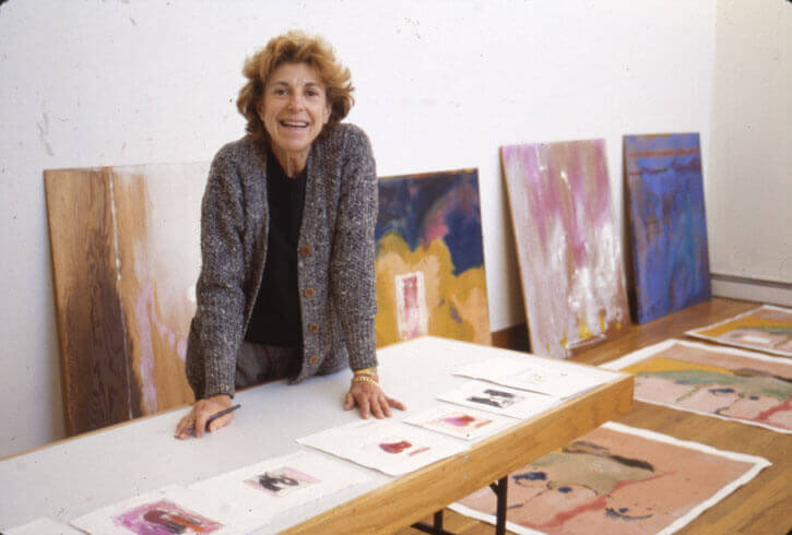
Helen Frankenthaler (1928-2011) was an American painter, and one of the very few women from the second generation of abstract expressionists to have gained recognition and success during her lifetime while paving the way to Colour Field Painting. She is credited in that regard with inventing the ‘soak-stain’ technique in the 1950s, diluting oil paint with turpentine and pouring it onto an unprimed canvas on the floor, letting the paint soak and stain the canvas; the medium and support melting into one, flat yet infinite space, radiating with layers of transparencies and colours. Frankenthaler famously said that she wanted her work to appear as if it had been ‘born in a minute’, rather than giving any insights into the hours, sometimes days or months of hardship and challenges it took to create. Accordingly, she had an exact and demanding attitude towards her work, once saying ‘in order to have something really move, and work and be beautiful, it takes a lot of time and effort and being explicit and being demanding and being controlling.’ She also relished bending and challenging rules and expressed an endless curiosity for techniques, tools, and any possible ways that would help her push her experimentation with line and colour as far as possible.
These qualities perhaps explain her love of and involvement with printmaking, a process known to be technical, laborious and challenging. If many artists have tried their hands at printmaking, few have come to build a relationship with it whose legacy is as long-lasting as that of Frankenthaler. Over the course of fifty years, from her first lithograph First Stone, 1961, to the wonderfully expressive woodcut Weeping Crabapple, 2009, she produced over 300 original prints. Although she came to it reluctantly in the early 1960s when painting was held supreme, she eventually got seduced by the struggle printmaking enticed, entering into a relationship with the matrix (be it stone, copper, wood or else), to understand its limitations while accepting her own, and realised that the complexity of the process was a gateway to unbound creativity. She referred to her work in printmaking as a ‘romance’, a ‘flirtation’, and when describing her first foray into doing a print, famously said ‘of course, I was hooked.’
Importantly, this ‘romance’ started at the time of the American Print Renaissance, taking place between the mid-1940s and late 1980s (this was responsible for many a love affair between artists and prints). If in Europe printmaking was acknowledged as a serious artistic endeavour, in the US it was still mostly considered either a cheap, industrial process linked to advertisement, or a heavily technical and nerdy one that few artists ventured into. This attitude changed with the development of print workshops across the country, in a context of excitement and great experimentation for artists. One of the main catalysers for this development was another intrepid woman, Tatyana Grosman, who founded ULAE (Universal Limited Art Editions) in 1957 in Long Island and paved the way for printmaking to be recognised as a major art form. Grosman was well-acquainted with European printmaking and, upon acquiring a lithographic press from a neighbour, took it upon herself to invite artists to make prints. Slowly but surely, she tirelessly convinced them to come to try their hands at printmaking. Key to Grosman’s success was her ethos of experimentation, encouraging trials and errors with patience, flexibility, tenacity, and passion. She would go above and beyond to help any artists achieve their vision, providing tools and expertise; her workshop became a nurturing place of buzzing creativity.
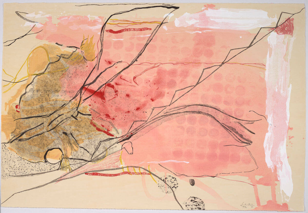
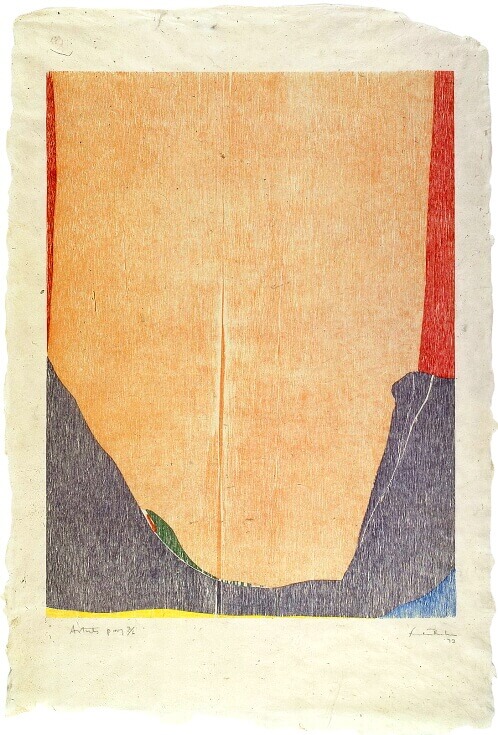
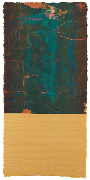
This is where Frankenthaler was eventually convinced to try printmaking, starting first with lithography as it was the closest medium to painting (lithography is done by drawing with greasy ink and crayon onto a stone, allowing for a lot of fluidity and gestures akin to abstract painting). As she ventured more and more into it, her instinctive call for challenges and experimentation – and Grosman’s encouraged her to make a woodcut. Interestingly, woodcut (the oldest form of printmaking where a design is carved into the surface of a wooden block), was often considered a restrictive, sturdy, and unmalleable medium, associated with figurative and narrative representations, seemingly miles away from the concerns of an abstract painter interested in fields of fluid, layered and diluted colours. And yet, hooked as she was, Frankenthaler recalls her first attempt at a woodcut in these words: ‘doing a fluid shape out of wood is so foreign to me. In a way, I guess it’s wonderful too. I struggle to transcend it.’ For this first woodcut, untitled East and Beyond, 1973, she managed the fluidity she sought by using a jigsaw, cutting the various shapes she wanted out of a thin sheet of plywood, each inked and registered (aligned) in a very specific manner so that the edges of each shape would blend into the others when printed, eliminating the traditional blank line that normally separates each area of the woodblock. The resulting print was flowy and luminous, so radical for this medium that the celebrated print curator Richard S. Field proclaimed it to be ‘a departure so profound that virtually all subsequent woodcuts incorporated the thinking it embodied.’
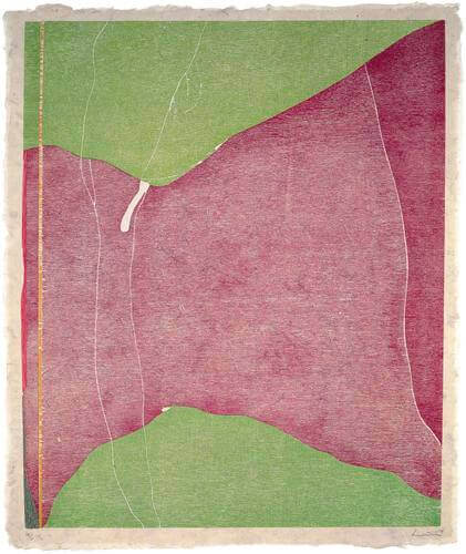
The romance was to last a lifetime. In the trail of Grosman ULAE, other print workshops had opened, and Frankenthaler worked with several of them. In the early 80s, she worked with Crown Point Press (opened in 1962), in collaboration with the Shi-un-do Print Shop in Kyoto, Japan. Unhappy with the initial results of the woodcut made in Japan, she went there herself to make the print, studying the ukiyo-e technique (‘pictures of the floating world’, water-based printing) with expert woodcarver Reizo Monjyu and printer Tadashi Toda. The result was Cedar Hill, 1983, for which they chose a specific wood grain, used water-based inks, tinted paper and hand overprinting. Eventually, she started working with master printer Kenneth Tyler, who had established Tyler Graphics in 1974 in upstate New York. It is with him, between the late 1970s and until Tyler closed his workshop in 2000, that she was to revolutionise woodcut even further, innovating and challenging that ‘totally antimodernist medium’ to unprecedented levels.
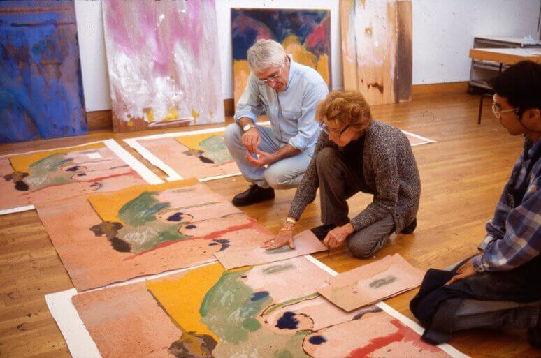
Tyler’s only rule in the workshop was that there were none, which was a prophetic beginning for an artist who only accepted rules (human, mechanical or material) if they could be challenged and transcended. Together with Tyler, they found what she called ‘a happy place’, whereas ‘he’s doing his creative thing and I am doing mine and together we are doing… something else. We allow for each other styles, and humour, and basically like and admire each other and what each of us does.’ This collaborative attitude is one of the most distinctive aspects of printmaking, and for someone like Frankenthaler who ‘don’t want people to change [her] line, don’t want people to muck with [her] colours’, it took a lot of trust, intuition and knowledge for Tyler and his team of printers to become the ‘magic tool’ she needed to achieve her printed vision. In a beautiful quote that perhaps best exemplifies the synergy at work in printmaking, she said: “I want to draw my own images, mix my own colours, approve of registration marks, select paper – all the considerations and reconsiderations. Assuming that those who work in the workshop are artists at what they do, I can then entrust the actual duplicating process to other hands that possess – hopefully – their kind of magic. Sharing and participating to the end. (…) It takes expert printers to follow my precise wishes in terms of registration, pressure, paper etc., etc. That is their domain. One has to rely on the vibration between the artist and workshop.”
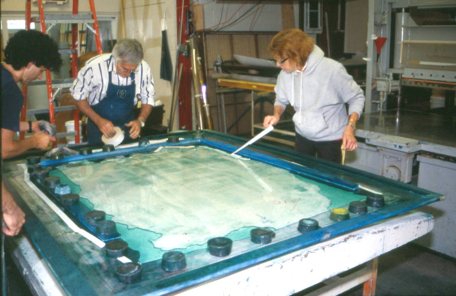
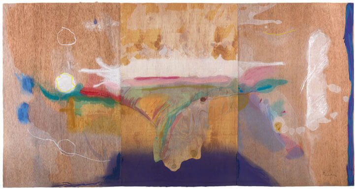
Thus she had embarked on the romance as exact and demanding as she had always been, fearless and confident, and, unlike other artists, did not simply create a design and let the master printers and studio assistants do the rest, but actively took part in every stage of the printmaking process, making her colours, examining, correcting and approving proofs, continually experimenting and innovating in her search for a precise result, one that would give joy and beauty to the viewers. She considered herself ‘an artist of quality’, one that creates ‘a beautiful graphic that “bleeds” sensibility, feeling, magic, head, heart – within the felt embrace of a sensitive workshop’. And indeed, walking across the sensational exhibition of Frankenthaler woodcuts, Radical Beauty, at the Dulwich Picture Gallery last year (15 September 2021 – 18 April 2022), I was struck by the impact her prints had on me. There was magic to them, the colours seem to be fluid and moving, their translucence in places almost glittering as if a river stream, and altogether one would struggle to see how a human hand would have created such perfectly abstract shapes of colours out of a woodblock. To achieve such wonder, seemingly evident and accidental, was no mean feat as the amount of work and ingenuity put into producing each woodcut would have discouraged more than one, especially at the scale at which Frankenthaler was working with Tyler.
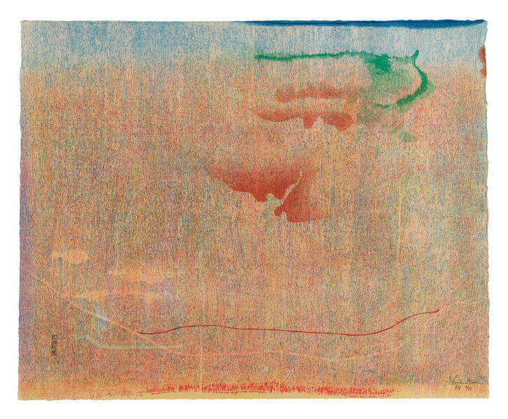
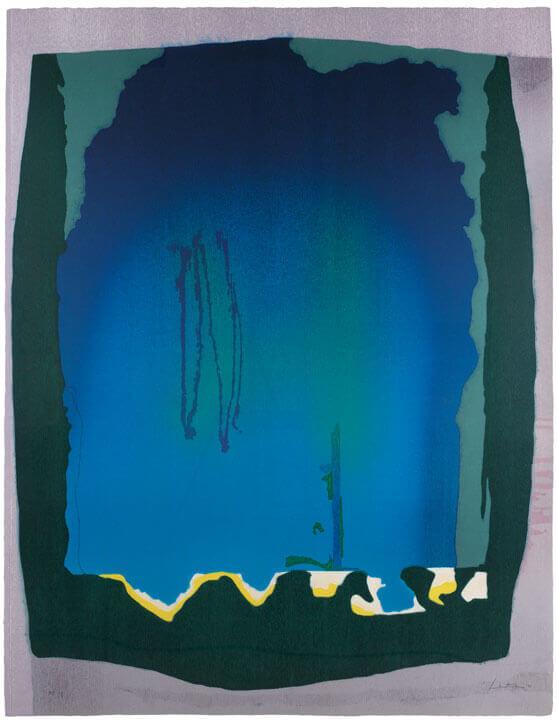
Their first considerable achievement was Essence Mulberry, 1977, for which they invented the guzzying technique, distressing the wood surface with various tools, including a cheese scraper, toothbrushes, and a power sanding wheel. She also pioneered the use of a rainbow roller in woodcut and used transparent inks; 65 different proofs were pulled before the final print was published. With Freefall, 1993, a monumental woodcut over two metres high, Frankenthaler was keen to test how big she could go with the process. Using a turkey baster, brushes, combs and hand-dyed paper pulp, the resulting print is an abyssal blue sensation made of 12 colours and one plate of 21 woodblocks.
The Tales of Genji series was made with Tyler and master printer Yasuyuki Shibata, an expert in ukiyo-e printing, with a new approach to the process that had never been done before, pouring diluted pigments onto the wood to better achieve the fluidity Frankenthaler was after. Produced over the span of several years – and 1,500 trial proofs! – the six final works in the series are composed of up to 53 colours. Considered her masterpiece in the medium, Madame Butterfly, 2000, created again with Shibata’s expertise, and her final work with Tyler, first strikes you as a painting; the ethereal vibrancy of its inking and colours on distinct handmade paper transcending what anyone might expect from a woodcut. When looking at it closely and long enough, the process starts to appear, and yet remains ambiguous. Although it took over one year to achieve, 102 different colours, four different types of wood and 46 blocks, its complexity is palpable but undecipherable, its beauty altogether fierce, quiet, sublime and evanescent.
As Jane Findlay, the curator of the Dulwich show expressed wonderfully: ‘[Frankenthaler] teaches us how to be creatively free – that beauty isn’t something to shy away from but is empowering.’ This visceral, empowering, experimental and labour-intensive quest for beauty is what I believe makes her prints so electrifying; beauty, and the joy that also sits at the core of her pursuits. About her exact, commanding attitude when proofing a print she said: “I do say no, on this line, it is registered wrong, it is supposed to meet this way, not that way, and I don’t want it to look under, and I don’t want it to look over. And lots of people sort of don’t care, and that to me is 1mm. of a whole surface that is going to be brought off and bring you joy continuously, or not.” Beauty and joy both remain suggestive of course, but for Frankenthaler, they were serious endeavours, and one can hardly dismiss an artist who sought to express them so intently, while continuously pushing the boundaries of what was possible with woodcut, in an enduring romance that opened-up a path for so many other artists, still to this day. And if I could but own one artwork it would be a Frankenthaler woodcut, to look at it every morning with renewed wonder, and start every day in awe.