Your currently viewing RAW Modern | Switch to RAW Contemporary
Black Eyes and Lemonade, 1951
Catalogue essay by Blanche Llewellyn
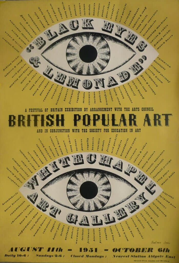
This artwork is the original poster for the Exhibition of Popular and Traditional Arts which was held at the White Chapel Gallery in 1951. Organised by Barbara Jones herself, the exhibition gave her the opportunity to arrange in a gallery space some of the actual objects she had previously drawn or written about in books.
Though produced in a relatively short period of time, the exhibition presented an interpretation of popular art that Jones had created over a number of years. Her definition of popular art challenged conventional understanding of traditional art, particularly through her inclusion of machine-made, mass-produced objects alongside the contemporary – celebrating the energy and the vibrancy of contemporary and mass- market equivalents.
As Catherine Moriarty has explained in her essay to accompany the Exhibition “Black Eyes & Lemonade: Curating Popular Art at the Whitechapel Gallery”, (9 March – 1 September 2013): “The title of the exhibition was chosen because it emphasized these very qualities. It was taken from a poem of 1813 by the Irish songwriter and entertainer Thomas Moore which Jones felt expressed, “The vigour, sparkle and colour of popular art rather better than the words “popular art”(…)
Writing about “Popular Art” in August 1951, Athene: Journal of the Society for Education in Art, stated.(…)“Though the fine arts express the artist’s mind and eye, the sole aim of popular art is to please the consumer. It may please with charm, gaiety, luxury or horror but it will never seek to exalt. Popular art can be a pretty china plate saying in fat black letters GOD LOVES ME, but it can never be the ceiling of the Sistine Chapel”
Jones often amalgated word and image and much of the popular art she valued did so too – packaging, banners, samplers and pub mirrors immediately come to mind. “Black Eyes and Lemonade” included a contemporary example borrowed from Batemans opticians in Croydon – Jones’s hometown – whose shop front she had drawn and which is reproduced in her book, The Unsophisticated Arts, 1951. Jones was to represent the disembodied eye in a number of contexts to denote the significance of vision, undoubtedly the greatest effect in her exhibition poster. A magnificent design…it also incorporates her love of conjoining text and image and her penchant for lists(…). As well as organising the exhibition, Barbara Jones designed its striking black and yellow poster and the cover of its catalogue.
Both emphasised the significance of the exhibition’s title and made it clear that it – prioritised looking. The eye motif was used widely by design promotion organisations in their exhibitions and publications to emphasise the need for consumers to exercise scrutiny and discernment. In contrast, Jones’s eye suggests pleasure, each lash of text forming a radiating list of the kinds of popular art included in the exhibition. As Hugh Scrutton, the Director of the Whitechapel Gallery put it, ‘it looks splendid in the Underground and I am very glad we put it there.’

